


Norton Utilities 3.0 Intergrator
Symantec Corporation, 1998
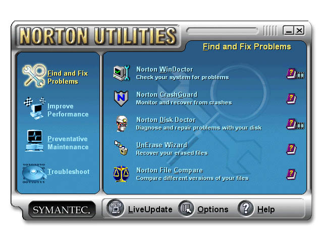
Traditionally, the Norton Utilities were expert-level tools for tuning and fixing a computer. With Norton Utilities 3.0 Symantec wanted a graphical and coherent access point to its tools so it is easier to use. It was an important component, which is probably why I designed the look of it over 35 times...
The layout of the integrator was done with the help of the usability experts at Symantec. This was good because I did not want to get stuck with deciding which of the 20+ tools went with which category. My job was to create a friendly, aesthetically pleasing and non-intrusive design for the look of the interface. I aimed to do this by doing the following:
+ Aesthetically Pleasing, Non-intrusive: Subtle colours - Through all the exploratory iterations, I stuck with medium to low saturations and gentle gradients that would blend well the average Windows environment. The final design (actually, iteration 7 or so) was something that an user can look at everyday without eventual aversion.
+ Friendly: rounded edges and buttons - My concept of rounded corners made the Integrator more approachable to the average user on a subliminal level by steering away from any indication of sharpness and severity. I did the best I could to incorporate the original tool icons into the interface.
+ Easy to use: Because there were 4 categories with 4 or 5 tools in each category, locating a particular tool was a potential issue.I watermarked the category icon in the background of the tool frame to help the user associate the tools with their sections. I wanted to put a command line on the interface for the expert users to type in a desired tool name, but there was no time to implement that feature.
©Richard Yeh