


Norton Uninstall 2.0 Integrator
Symantec Corporation, 1998
The design from Norton Utilities 3.0 worked well enough to be repeated the Norton Uninstall products, and also in Norton SystemWorks.
As the leading graphic designer for Norton Uninstall 2.0, I incorporated the concepts that worked well for NU 3.0, and improved a few things:
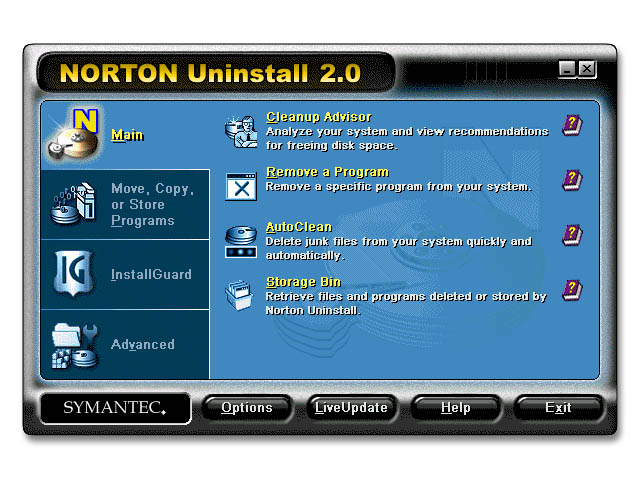
+ Removed the gradient in the content frames- Because the interface was created to support a minimum of 256 colours (a standard still in 1997 and 1998) this was done to minimize the number of colours used in the interface so that the icons can have more colour entries in the palette.
+ More detailed icons - I got to do many of the icons in Norton Uninstall 2.0, no longer restricted to the 32x32x16 colour constraints of older designs.
+ More compact design- This design was quite a bit smaller than the NU3 Integrator, taking up less of the desktop.
+ Detail tweaks from usability reports: I made the buttons more "pressable" looking, and removed the wall between the category and content frames to adapt a clearer connect between the two frames. It was really amazing how these little details made things so much clearer and easy to use for so many people.
Because Norton Uninstall 2.0 was not a star product like NU3, the design of the Norton Uninstall 2.0 Integrator did not take as long as the NU3 Integrator.
Due to a competitor's legal action against Symantec's subcontracting developers for this product, Norton Uninstall 2.0 was shelved and never released about half a month before its release to manufacturer.
The world may never see the hundreds of icons and wizard bitmaps that I did for this project.
©Richard Yeh